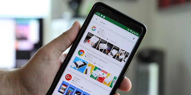
Google Play Store testing card-based search interface w/
thumbnails
Google is constantly testing out new tweaks to its interface in
various applications, and today a new Play Store search UI is rolling out to
some users.
Seemingly rolling out to a handful of users, myself included, over the past 24
hours or so, this new search UI adopts a card-based look. Results are split up
into their own large cards, showing the app’s icon, ratings, developer
information, and even how many times it’s been downloaded. In addition to all
of that, the card even shows screenshot thumbnails from the app listing
directly in search.
This new
interface shows a ton of extra information compared to what was
previously available, which is nice, but it does have some
downsides. The biggest issue here for me personally is the extra space that
information takes up.
A typical
search now only shows 3-4 results before you have to scroll, where the previous
UI could show 6-7. The overflow menu which acted as an install shortcut has
also been removed. Now, users need to tap through to the full listing to
install an app.
As usual with
these limited rollouts, Google may or may not decide to roll it out on a wider
basis.


0 comments:
We Cherish Your Comments Most, Kindly Drop your comments below. Don't forget to click "Notify Me" to know if we have responded to your comments, Thank You.